
I've finally got around to continuing my Listography series based on Lisa Nola's book. After the collection of 71 lists that Nola has put together are a series of blank lined pages for you to come up with your own lists. Today's post is my first based upon a list of my own creation.
I'm a sucker for great film artwork and find that I very often will decide whether or not to watch some films based on the poster art. With this in mind I thought it would be fun to share with you some of my absolute favourite film posters.
As with my other lists I have limited myself to just 10 entries for now, but it was so easy to reach this goal that I can see myself posting another 10 for this list very soon.
For now here are some of my favourites...
The Place Beyond The Pines
 Derek Cianfrance's follow up to his brilliant Blue Valentine, The Place Beyond the Pines, was one of my favourite films of last year. The ambitious narrative spanned two generations and three interlocking stories, but the clear standout of the group was Ryan Gosling as motorcycle stunt rider Luke. His story was the most accessible and engaging and instantly earned a spot among the growing number of iconic roles that Gosling has been gathering. I first saw this poster when it was revealed as the inspiration for the Blu-Ray steelbook release artwork. The limited colour scheme of red, white and black is both clean and dynamic with a simple illustration of Gosling's profile providing a wonderful tribute to the film's most recognisable character. The quote 'If you ride like lightning you're gonna crash like thunder' was used a lot in the films marketing, and rightly so as it encapsulates the self-destructive characters and the narrative that they occupy. I adore this poster and really love that I am able to have it in steelbook form as part of my collection.
The Cabin in the Woods
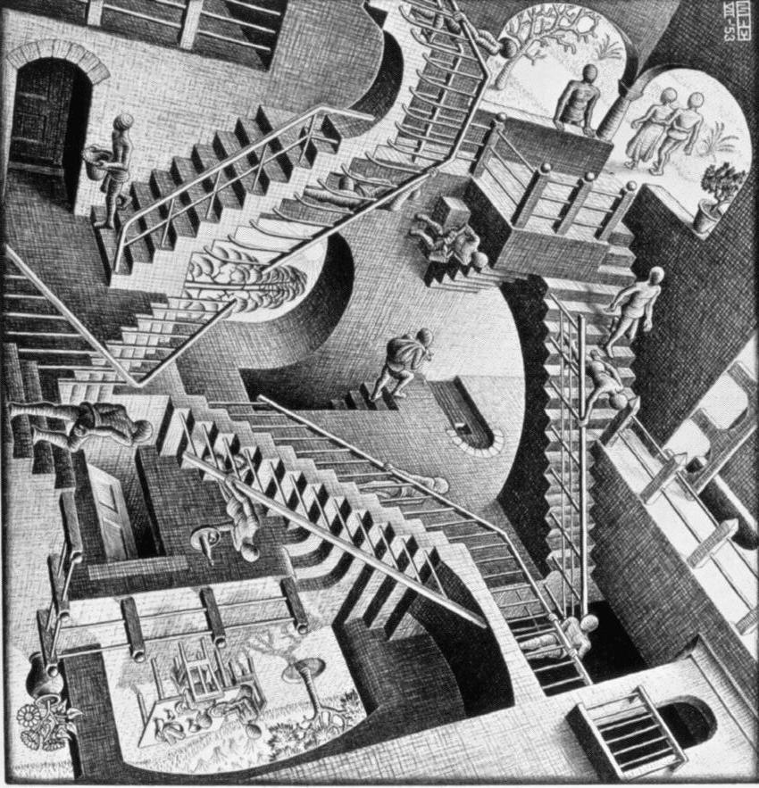
 Taking a step back to analyse and wittily spoof the horror genre and it's numerous tropes The Cabin in the Woods was one of the biggest surprises of 2012 and an instant gem. The film got two pretty great posters that illustrated the complex and inventive plot without giving anything away. While the more simplistic, studio-created version got the most exposure, this stunning illustration from Mondo is my personal favourite. The design clearly borrows a lot from the work of M.C Escher and his Relativity piece, but the concept lends itself perfectly to the themes present in the film. It is immensely detailed and of the incredibly high standard that Mondo always produce. The tagline is perfect and there is a subtle nod to the *spoiler* forcefield that surrounds the cabin *close spoiler*. This is a perfect example of film posters that could work just as well as artwork for your home, and shows a level of creativeness that I wish we could get from so many other film posters.
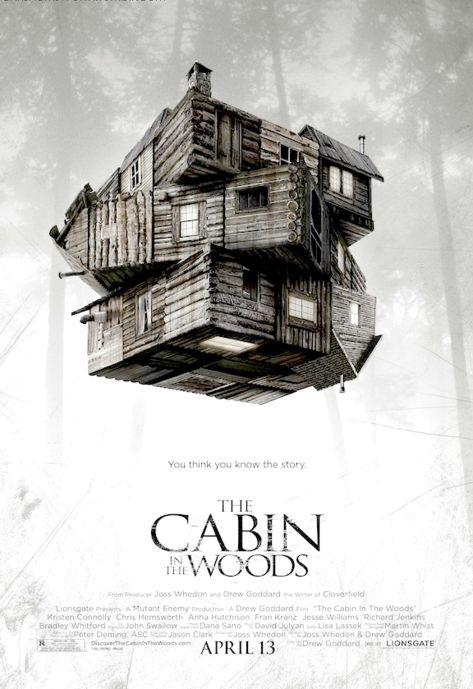
The Skin I Live In
 Pedro Almodóvar is a director who I have loved following because of his unpredictability. Though his films are predominantly Dramas they each seem to possess a unique strand that makes them stand out as uniquely different from one another. As a firm fan of the horror genre the promise of Almodovar delving into this region of film with The Skin I Live In was something I found very exciting. The film became an instant favourite, but despite featuring some truly beautiful images and cinematography none of the posters I saw for it were particularly inspiring. The image of Elena Anaya in that plastic face mask is certainly intriguing and creepy but I didn't think it made for a great poster image. Fast-forward to the DVD release of the film and HMV brought out a copy of the film that came with a card slip-cover featuring the beautiful painting that hangs behind Antonio Banderas' desk in the film. The stunning artwork is mysterious and vibrant, with the skinless figure vaguely suggesting themes of the plot without making any explicit statements. This is another example of artwork that convinced me to buy the film as soon as it was released, it's as unique and exciting as the film itself.
On The Waterfront
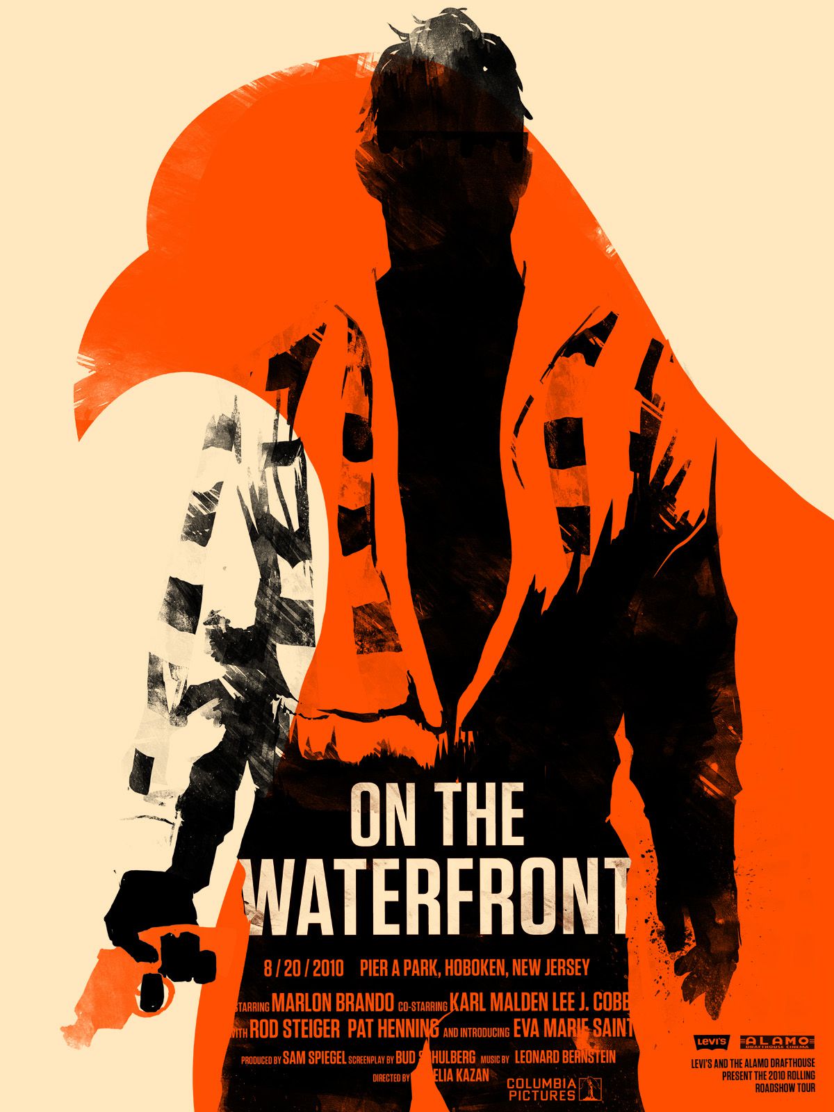 Last year my crush on Marlon Brando reached boiling point and I found myself going on a binge of as many of his earlier films as I could get a hold of. While A Streetcar Named Desire was by far my favourite of his films On the Waterfront was as magnificent as I had been led to believe it would be. Brandos performance was spectacular and when I stumbled upon this poster I was won over by it and its use of his silhouette as the focal image. The use of the pigeon's profile as an overlay works extremely well to illustrate a powerful metaphor from the film, and colouring the gun in Brando's hand the same as the pidgeon's silhouette further emphasises this. I adore the bold colour scheme for its bravery and trying something different. I'm not sure where this poster is from, or if it's even official, but I'm in love with it and think it would be a good option for any possible future Blu-Ray releases of the film as it's something unique compared to the detailed painted posters that are common for films of the period.
Insidious
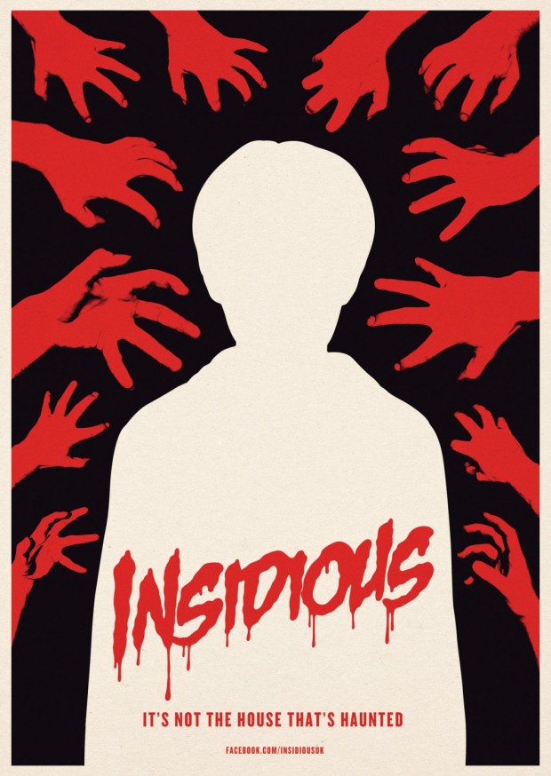 I've professed my love for Insidious time and time again on this blog, and it's time to do so again. As much as I do love Insidious though, the posters all left a lot to be desired, with most of them simply using a giant picture of Ty Simpkins face looking all spooky//evil. They all made the film look like any other generic haunted house story, but Insidious offers so much more and deserved a poster that reflected that. The film was one of many to be shown as part of a weekly cinema screening at my University, and it was in the programme for those screenings that I first saw this fantastic piece. Again we have a limited colour pallette of red, white and black, but this time used to a compeltely different effect. It's classic colour symbolism - an innocent child's silhouette in white against a pitch black background while sinister red hands reach for him - and it works fantastically well and looks great too. It reflects a crucial aspect of the plot and represents the film a lot better than the actual posters, which made it resemble more of an Omen ripoff. The blood drenched lettering is a bit cheesy but it fits well with the style of the poster. I really do love this one so much.
Wait Until Dark
 Wait Until Dark is a real gem of a film that I found completely by accident and fell for instantly. This poster is very clearly a product of the 60's illustration style that features on so many posters from that decade, but it's a really great example of it. I particularly like the choice of such vibrant pink hues for the colouring as these are in stark contrast to the darkness of the plot and the films actual cinematography. It's not the best composition for a film poster, the little silhouetted figures at the bottom look pretty tacked on, but it works well in my opinion. I love the slatted Venetian blinds look of the main image, and the picture of Audrey in peril works well to sell one of the films most defining features. The descriptive tagline is also a brilliant way of setting the tone of the film and teasing what viewers can expect.
The Perks of Being a Wallflower
 If you haven't already noticed, I tend to favour posters that are illustrated as opposed to simply photoshopped together. Well this poster for The Perks of Being a Wallflower is one of the best posters of recent years and a perfect example of how great a poster thats showing off it's cast can be. First of all the colour is fantastic, it's a vibrant eye-catching colour that also very unusual for a film poster. The composition is perfect, using empty space really well and bravely confining the stars to only the bottom third of the sheet. Another brave decision, and one that was amended by the abysmal DVD artwork, is the choice to have leading man Logan Lerman not take the central position and receive the most attention. Everything about this poster indicates that the film will not be the typical coming-of-age//teen romance film that you expect it to be. That infamous tagline gets central positioning, and rightly so as it is a sure nod to fans of the book and epitomises the story, I just wish it was in the same great typewriter font as the title. Anyone who read my rant about DVD artwork will know that this poster getting snubbed was one of the major catalysts for my anger, and I'll never forgive the DVD people for denying me a copy of this film encased in a slip-cover of this perfect poster.
The Kings of Summer
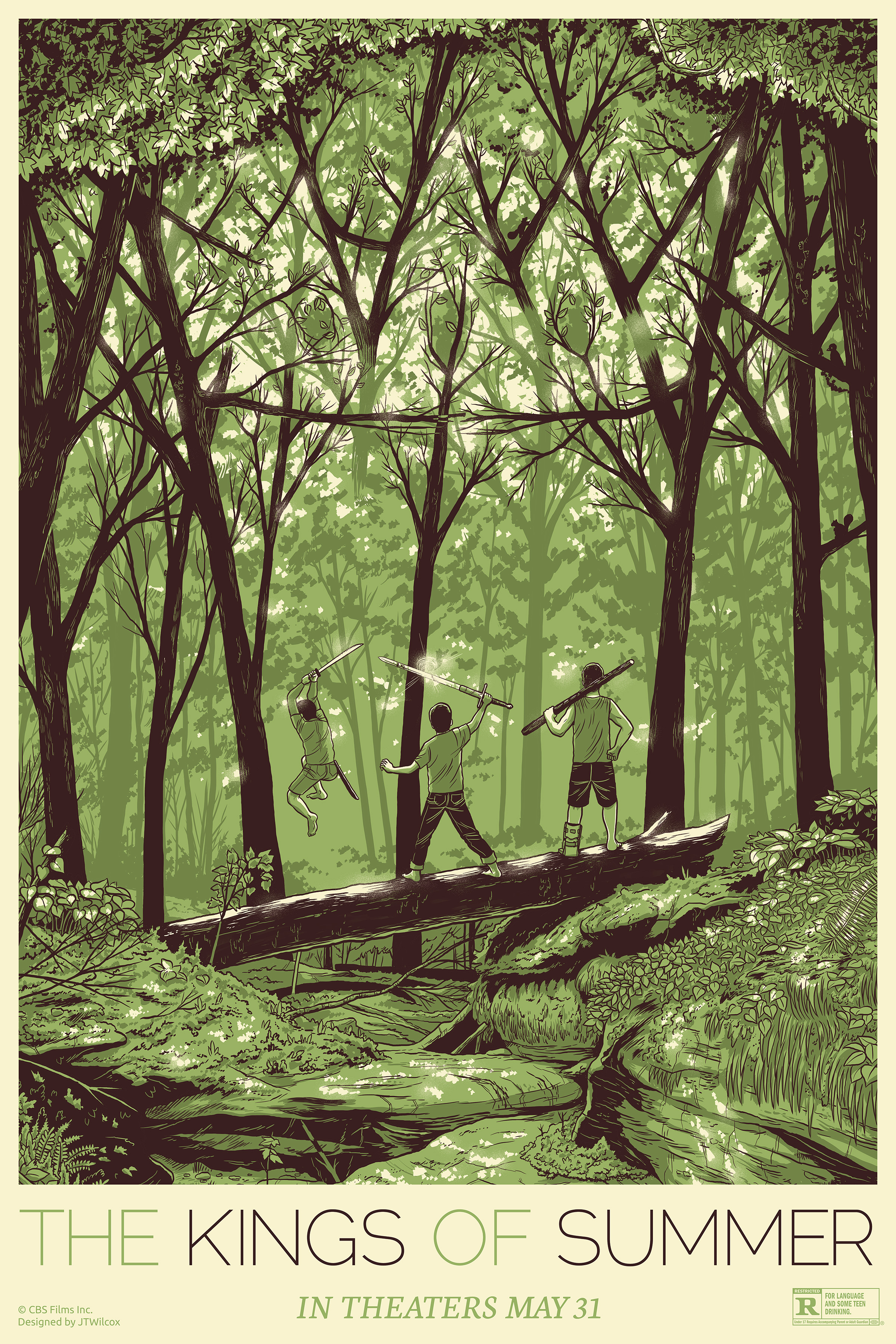 When The Kings of Summer snook out of nowhere and became one of my absolute favourite films of last year I can honestly credit the beautiful poster of the three protagonists diving into a river with being the sole reason I decided to give it a chance. Not only did I fall for the film, I fell head over heels in love with the promotional campaign surrounding the film. I mean just take a look at the film's official website and tell me that it isn't magnificent. I could have chosen any one of the films countless illustration, quote or character posters to showcase here because every one is brilliant. This is my personal favourite though, I just love the green colour scheme, the gorgeous illustration of the lush forest and the sense of adventure and youthfulness that it inspires. I look at this poster and I remember little moments from the film, I hear the tribal pipe music that the boys create and most importantly I want to watch the film again. After all, that's the point of a film poster isn't it?
Heartbeats
 I adore Xavier Dolan. In my eyes he can do no wrong and his second film, Heartbeats, is an impeccably stylish exploration of obsession within an unusual love triangle. The films poster is made up of three separate posters that combine into one, each featuring on of the three main actors; Dolan, Niels Schnieder and Monia Chokri. Each of the three posters is a solid block of colour with beautifully illustrated portraits of the actors. The use of three different colours makes each poster unique and yet still feel like part of a set, while also creating a striking image that romanticises each actor//character. In a way the three posters and their differing colour schemes come together in a slightly crude manner that doesn't look quite right but I would argue that that only serves to enforce a central theme of the film. Each one is gorgeous and together they make one of my favourite sets of character posters for any film.
The Dark Knight
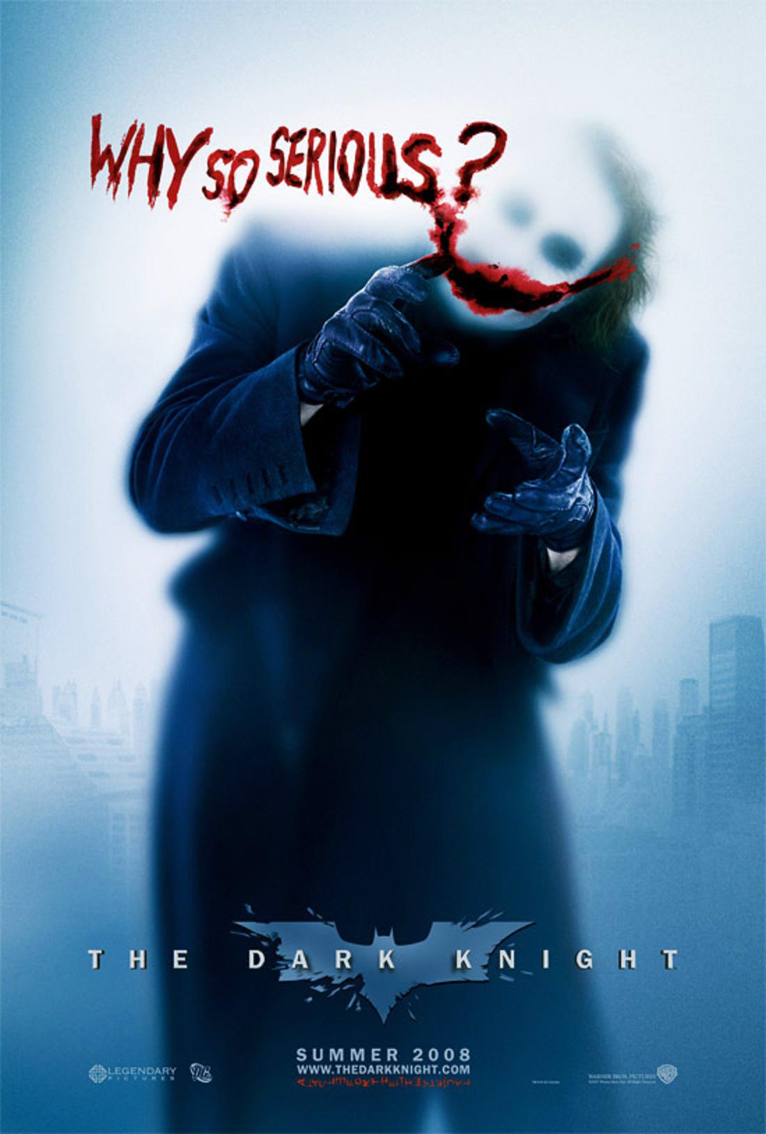 When Christopher Nolan revitalised the Batman franchise with his Dark Knight trilogy he not only made the caped crusaders crime-fighting more exciting and intelligent, he made it more stylish. Both The Dark Knight and The Dark Knight Rises received an absolute slew of posters that showcased every appealing aspect of the films that they could. With a collection of posters so extensive as these these there is obviously a mixture in the quality of the posters, but even with some less impressive designs there are a handful of truly spectacular ones. My undoubted favourite poster from the franchise is this one of Heath Ledger's Joker. Due to his tragic death there was an immense amount of hype surrounding Ledger's dark interpretation of Batman's greatest foe and this poster was our first glimpse at what Nolan had in store for us. Hidden behind a frosted screen Ledger is his Joker, with the posture and styling that has made his character so iconic and recognisable. The use of his signature quote and that grisly cheshire grin painted in blood emphasises the threat that this character poses while also highlighting his dark humour. The muted colour palette only hints at the instantly recognisable combination of purple and green and does a brilliant job of teasing us to one of cinemas most impressive villains of recent years.
When Christopher Nolan revitalised the Batman franchise with his Dark Knight trilogy he not only made the caped crusaders crime-fighting more exciting and intelligent, he made it more stylish. Both The Dark Knight and The Dark Knight Rises received an absolute slew of posters that showcased every appealing aspect of the films that they could. With a collection of posters so extensive as these these there is obviously a mixture in the quality of the posters, but even with some less impressive designs there are a handful of truly spectacular ones. My undoubted favourite poster from the franchise is this one of Heath Ledger's Joker. Due to his tragic death there was an immense amount of hype surrounding Ledger's dark interpretation of Batman's greatest foe and this poster was our first glimpse at what Nolan had in store for us. Hidden behind a frosted screen Ledger is his Joker, with the posture and styling that has made his character so iconic and recognisable. The use of his signature quote and that grisly cheshire grin painted in blood emphasises the threat that this character poses while also highlighting his dark humour. The muted colour palette only hints at the instantly recognisable combination of purple and green and does a brilliant job of teasing us to one of cinemas most impressive villains of recent years.So those of some of my favourite film posters. Do you agree or disagree with my choices? Be sure to let me know and point me to some of your favourites too!
You can find my list of Favourite Animated Films here, and my Guilty Pleasures list here.
No comments :
Post a Comment